XForce Country Dashboard
I served as the Lead UI/UX Designer across multiple projects in the pharmaceutical industry. The project below was one of my first engagements with this client.
Business Context/Overview
The xForce Country Dashboard provided sales teams across the EMEA region with a consolidated view of sales activities and supported sales planning. However, limited internet connectivity and the dashboard’s complex data structure made the experience inefficient for many users.
The goal was to create an offline solution that provided access to essential dashboard functionality while delivering a faster, more efficient user experience.
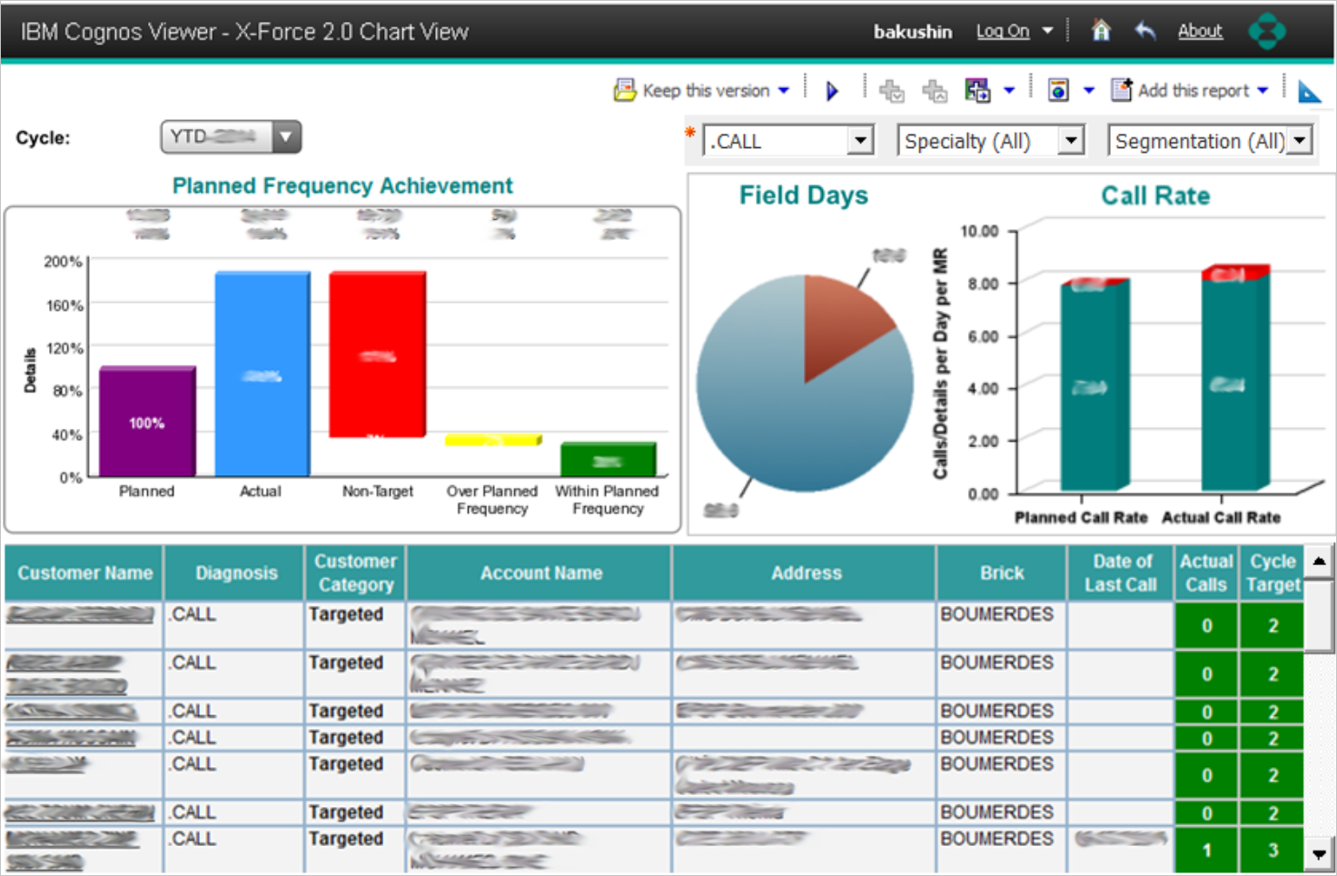
The business team provided initial wireframes based on the existing solution and various online reports. These served as the starting point for the design process.
Users
The solution was designed for two primary user groups: Sales Representatives and First Line Managers, with the iPad serving as their primary work device. The project began with limited additional user research or behavioral data.
Challenge
One of the key challenges was creating a functional, visually engaging dashboard without increasing report size or compromising performance. Because the reports contained large and complex datasets, the visual solution needed to remain lightweight and efficient.
Another challenge was the absence of an established design system or style guide. I worked within the existing brand guidelines to create a consistent visual language while maintaining alignment with the company’s overall brand identity.
Design Process
Due to the complexity of the data, we divided the dashboard into two separate reports.

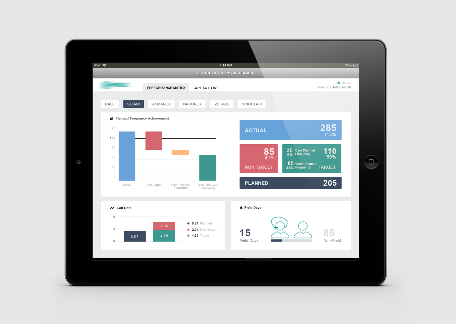
The Performance Report provides a quick overview of sales representative activity and performance. It helps users answer key questions:
What is the ratio of field to non-field days?
How does the current call rate compare with the planned call rate?
What is the target frequency achievement?

The Contact Report provides key customer information and related call activity. It helps users quickly answer two important questions:
Which customers are my priority targets?
Which customers should I contact next?
Data Visualization
When designing data-heavy experiences, I focus on the relationships between data points and the story they communicate. I used consistent color coding across the dashboard to make these relationships easier to understand—for example, red consistently represents non-target customers.
I also refined several charts to improve data clarity and accuracy. In the waterfall chart, the target was always 100%, so I replaced the redundant target bar with a reference line. In the Call Rate chart, I removed the Non-Target category from planned calls because it did not accurately represent the underlying data.
The examples below illustrate my design process and the decisions behind these data visualization improvements.


Result
This was my first project with the client, and its success helped our company secure additional engagements with the organization. The design was presented globally and received highly positive feedback for its KPI visualization, usability, and visual design. The final dashboard delivered strong performance while keeping complex data clear, simple, and actionable.


